
Mobile Apps Development
Mobile Apps Development in Android, IOS

Responsive mobile development
The explosion in growth of Smart phones is going to continue and with this more people are going to surf the web on their mobiles and tablets. Countries like India where the PC penetration is low, consumers are going for smart phones in a big way. This is due to dropping phone prices as well as advent of new technology like 4G which makes owning a smart phone a desirable and cherished thing.
Traditional PC Sales down, Mobile & tablet sales up
Sales of traditional computers like desktops and laptops are slowing down big time while sales of smart phones and tablets as well as phablets are rising year after year. This is also a wake up for website owners. Rather than having a website suitable for desktop and then trying to modify it for mobiles and tablets, one should ideally have responsive mobile development as that will ensure that websites are optimized for mobiles, tablets as well as PCs.
Responsive design
Responsive design is an approach to web design aimed at crafting sites to provide an optimal viewing and interaction experience—easy reading and navigation with a minimum of resizing, panning, and scrolling—across a wide range of devices (from desktop computer monitors to mobile phones) For eg, a website might have three columns that easily display on a desktop computer. However, on a small smart phone these columns exceed the screen width. Responsive design enables an alternative set of styling to be specified that transforms three columns into three rows for narrow screens.
Strategies of Responsive design
It does not matter whether one designs for mobile devices or traditional devices, one can use the power of CSS to ensure that the same content can be accessed across all hardware platforms, from mobile phones to wide-screen high-resolution displays.
• Liquid or fluid layout: Defining all container widths in terms of percentages of the browser viewport, so that they expand and contract as the browser window changes size.
• Media queries: Invoking different style sheets based on the capabilities of the display being used, such as size, resolution, aspect ratio, and color depth.
• Fluid images: Setting images to occupy at most the maximum display width.
Majority of traffic to come from mobiles
As the future shifts to mobiles and tablets completely with majority of internet traffic being generated from these devices, it makes complete sense to incorporate responsive mobile design right from the start.
"How We can help you?
We are digital marketing experts who will help you with responsive mobile development. With our expertise and skills we will build websites that can be accessed and optimized on any device. Thus the website will be device agnostic and will be able to reach the target consumers easily.
 owesomesoft is complete Solutions for web and Graphic Designing
 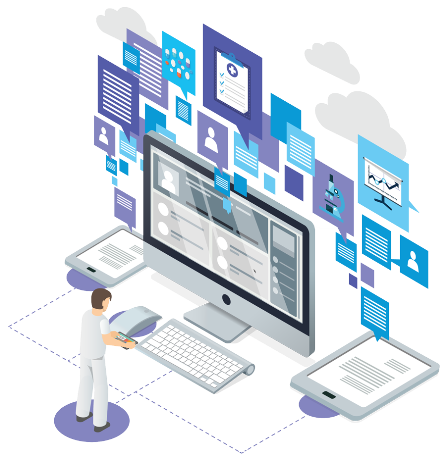 Are you looking to develop Application for Your Business.
  Some important Digital Marketing Services given below :
 Some important Website Security
  Owesomesoft is providing Corporate training to Corporates, Companies , Entrepreneurs etc
  World Cheapest Hosting Providing Company
 Some Readymade Software and Applications
 We are providing Free Services for beginner
 Some important Conversion feature are :
 .
Some important Digital Advertisment Technique
.
Some important Digital Advertisment Technique 

